Shane Campbell Gallery
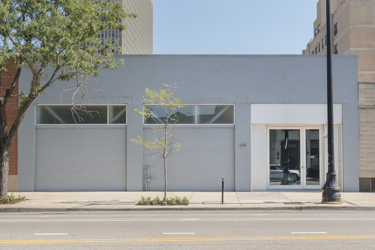
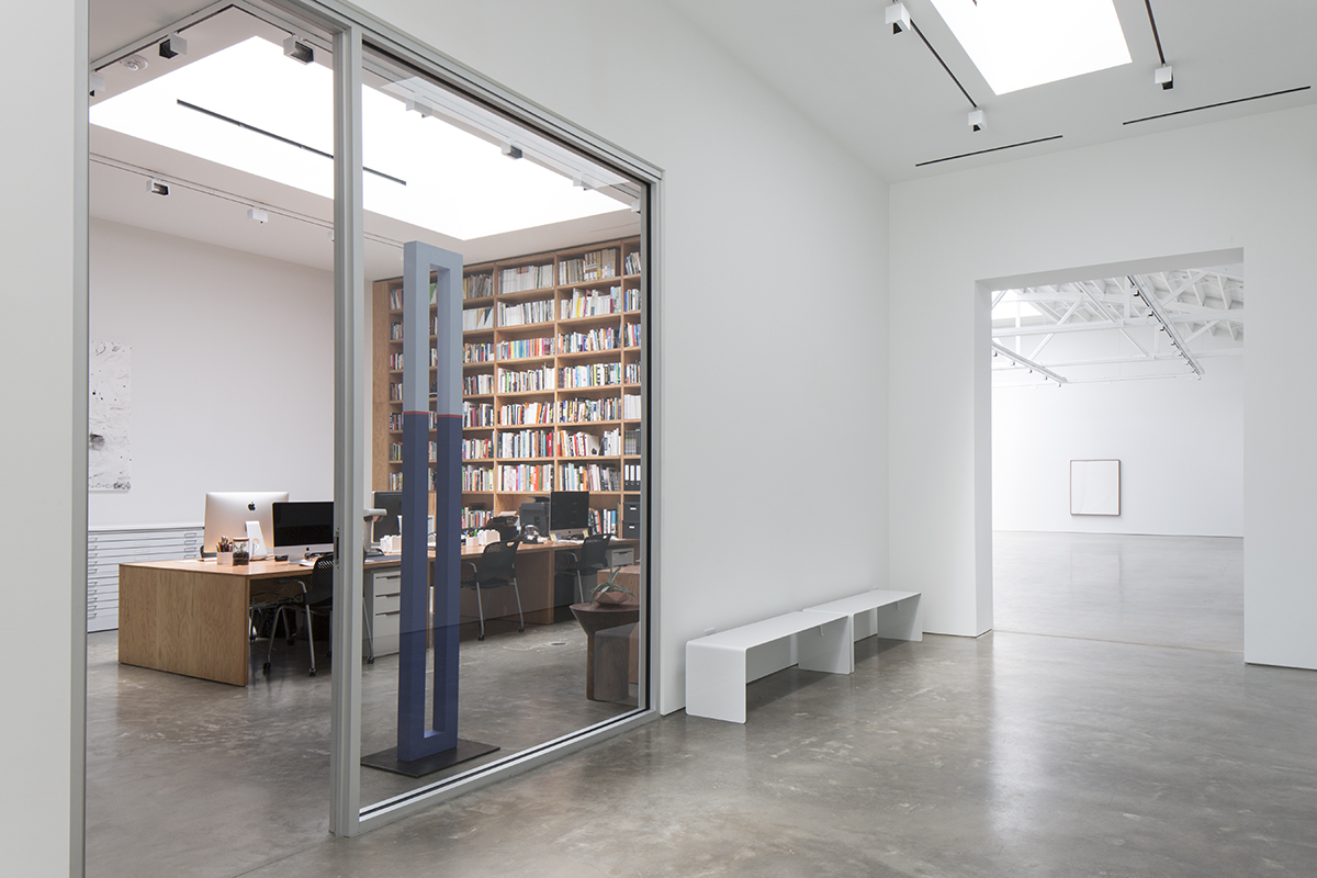
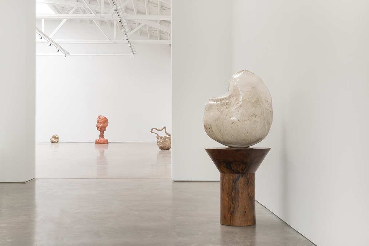
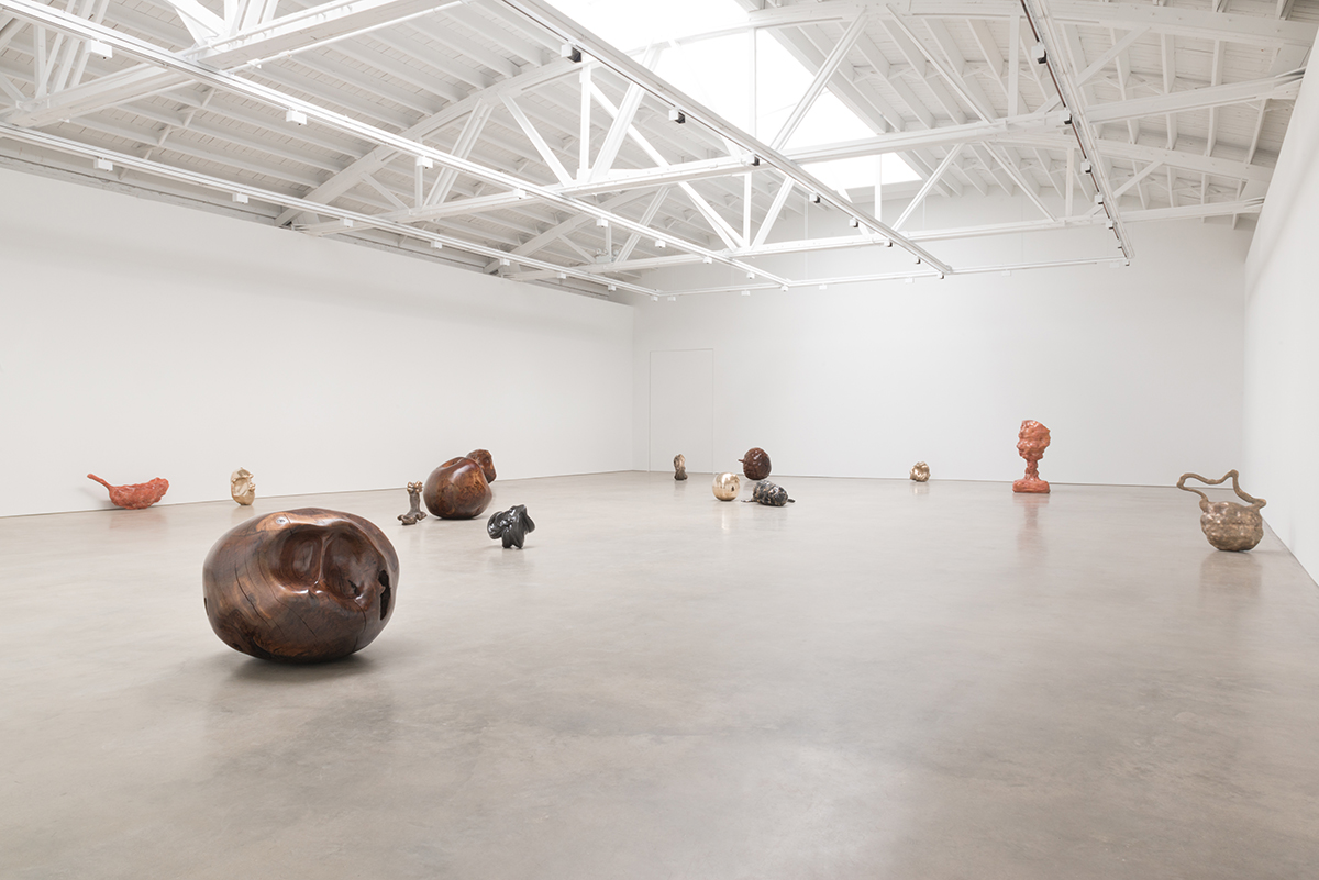
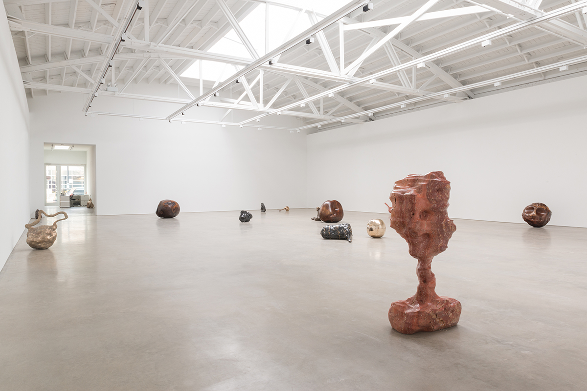
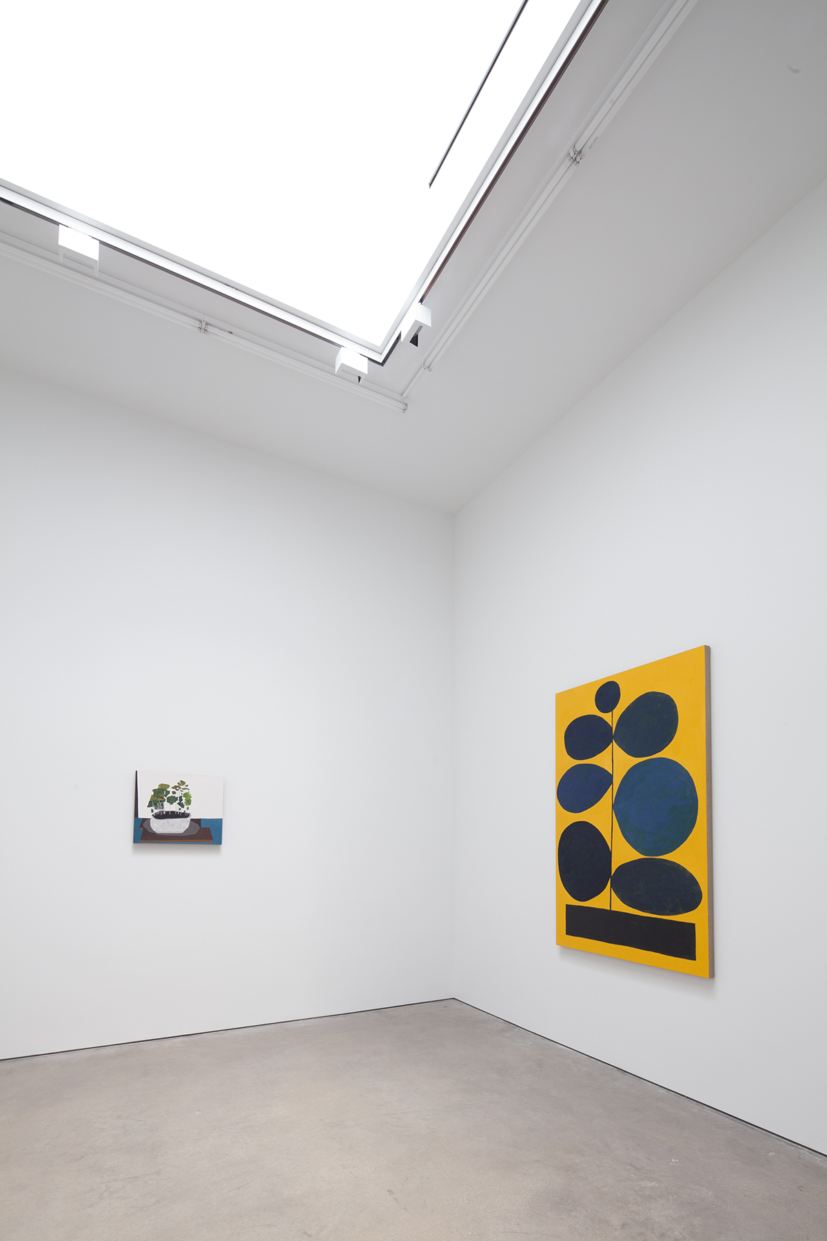
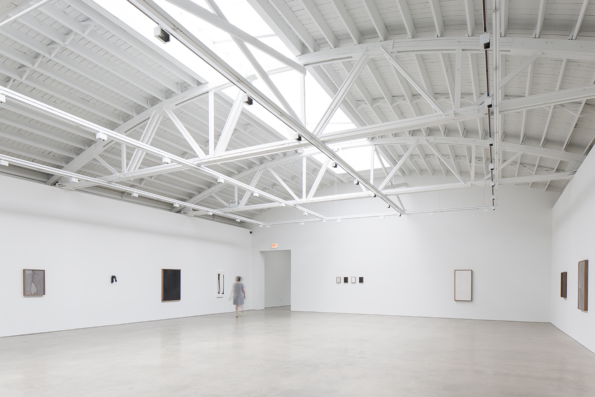
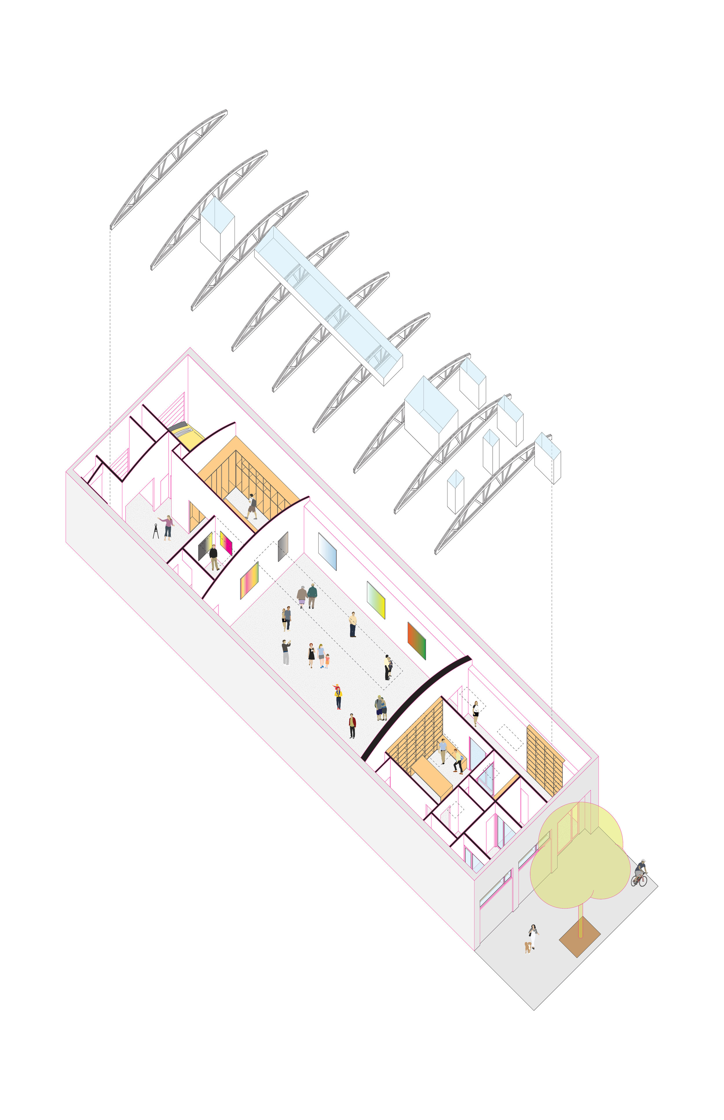
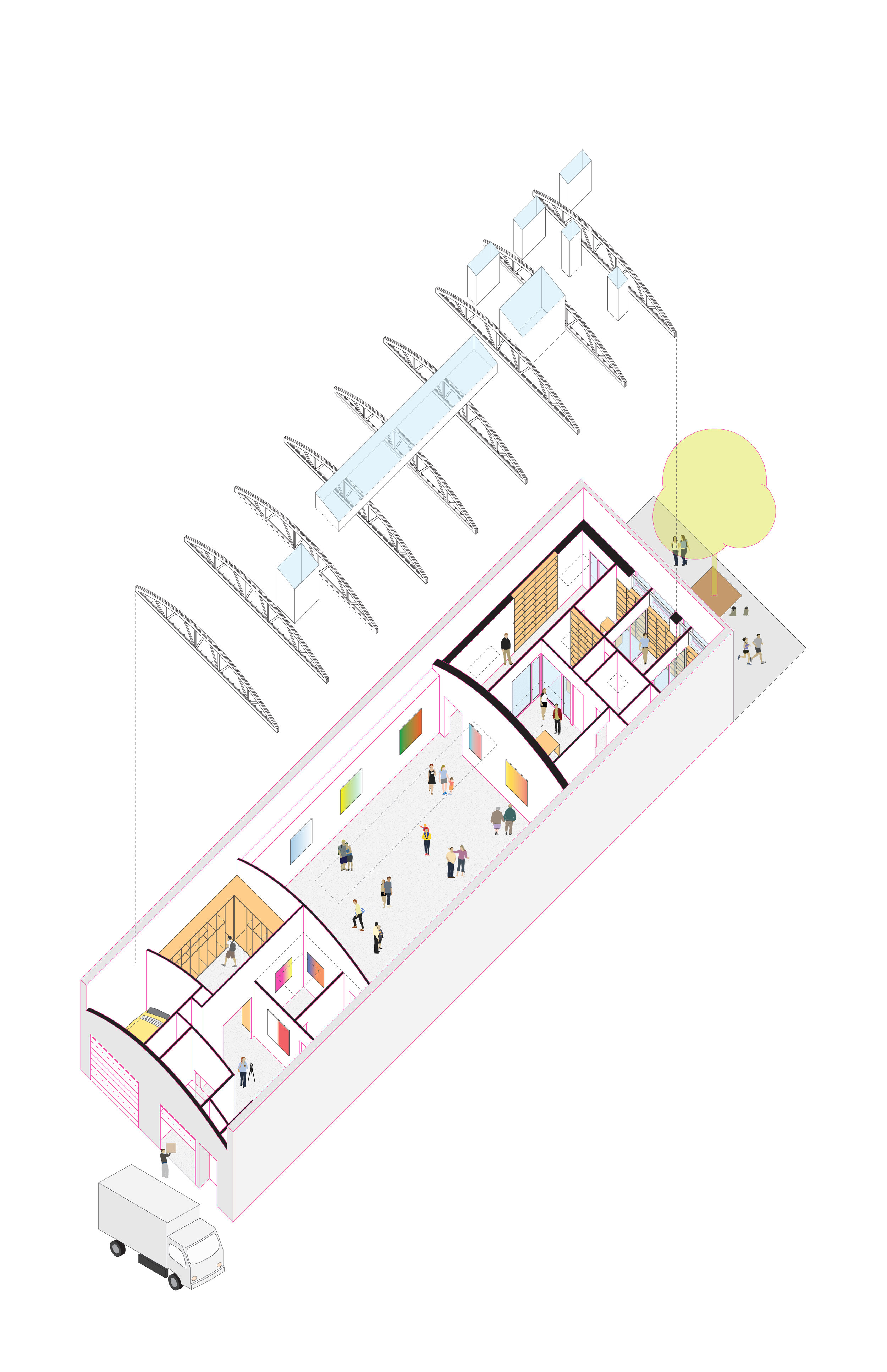
Seeking to create a new aesthetic and guest experience to support its evolving curatorial vision, Shane Campbell Gallery hired UrbanLab for its expansion and building renovation. With the concept of embodying art through clean, minimalist architecture, the design of the overall building is carefully layered. Visitors enter the light-filled vestibule through large, fully operable glass doors. An open office is visible behind a glass wall in the vestibule; and hidden from view, a secret office suite doubles as a home-away-from-home for the gallery owners. Natural light pours into the main gallery through a new skylight. This gallery is designed so that the artwork — its surface and materiality, lightness and weight, form and shape — engages the visitor in a space reduced to its most basic elements. Less detail allows for added emphasis on basic architectural elements — the bowstring truss roof structure, the concrete floor, building scale and proportion, and natural light. All other elements like ductwork and grilles, electric outlets, and light switches are hidden from view. This design approach positions the artwork itself as the essential component of the gallery. Behind the main gallery, hidden behind a frameless door, is an intimate flexible gallery, a photo studio, and art storage. The early industrial vernacular of the Chicago warehouse is both emphasized and simplified.
Photos by Michelle Litvin and Evan Jenkins
